Last month I started working on a WebGPU animation renderer so I could render animations directly in the web for this blog. It's not quite done yet, but along the way I've managed to implement a very cool technique for rendering TTF fonts. The technique comes from work by Loop and Blinn, Resolution independent curve rendering using programmable graphics hardware. According to Google, this work was patented by Microsoft in 2005, and just expired in March this year!
The technique is actually surprisingly elegant for the GPU and I think it's really cool. In order to understand this technique from scratch, I'm going to break down a little bit of everything, from fonts to graphics rendering and splines.
By the way, the animated GIF at the top was rendered using this technique!
I also spent a ton of time making little explainer animations for further on in this blog. Let me know if they help!
My True Type Font is Telling Lies Again
Let's start with True Type fonts (.ttf) because they are the one true font format. Open Type fonts (.otf) are almost the exact same structure as True Type fonts, and Web Open Font Format (.woff and .woff2) fonts are essentially just wrappers that compress True Type and Open Type fonts. So, understanding True Type fonts is basically all you need.
The format in which TTF encodes its information is frankly over engineered and very boring so I'm going to just completely skip that. You can check out Tomek Czajecki's blog post on TTF file parsing if your interested.
Characters in TTF fonts are made of glyphs. Each glyph is made up of paths, which are in turn each made up of curves. The hierarchy sort of looks like this:
- Font
- Character
- Glyphs
- Paths
- Curves
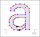
Each blue point in the a glyph is a start and end point for a curve. Each red point is a control point. Control points control (haha) the curvature of a curve. You can also see, for example, on the stem of the glyph some of the lines don't have a control point. When reading the curve data, I just add the control point back on the line, keeping it straight.
The a glyph is made of two paths. Looking at the image closely, you can see black arrows indicating the direction of each path. When the path is constructed clockwise, it is drawn filled in. When the path his constructed counter clockwise, it cuts out of the filled in area.
There's a neat little trick for detecting whether a path is clockwise or counterclockwise.
for (const point in points) {
    area += 1 / 2 * (lastPoint.x * point.y - point.x * lastPoint.y)
}

if (area > 0) {
    counterClockwise()
} else {
    clockwise()
}
This is just some pseudocode since dealing with the path properly is a bit messy. You can see the actual source here. We'll eventually use this to decide wether to use the contour of the shape as a cutout when we generate the triangulated mesh.
It's a Spliny Slope
Each curve in a TTF font is defined by three points: start, end, and control points. This is kind of curve is called a quadratic spline.
One really nice way to draw out the curve of a spline is with simple lerps.
function lerp(a: number, b: number, t: number): number {
    return a + (b - a) * t
}
Lerp is a super useful and common function in video games and graphics that Linearly intERPolates between two values based on a t from 0 to 1. That looks like this:
A quadratic spline is just a simple combination of three lerps.
function splinePoint(start: Vector2, end: Vector2, control: Vector2, t: number) {
    const a = new Vector2(lerp(start.x, control.x, t), lerp(start.y, control.y, t))
    const b = new Vector2(lerp(control.x, end.x, t), lerp(control.y, end.y, t))

    return new Vector2(lerp(a.x, b.x, t), lerp(a.y, b.y, t))
}
This construction is known as Casteljau's Algorithm. While this method is really nice for tracing out a spline's shape, it doesn't help us fill in a curve which we'll need to render our fonts. Instead, we need to talk about triangles and pixelss for second.
GPUs Only Want One Thing, and It's Triangles
A good mental model for thinking about how GPUs render graphics is to think in triangles and pixels. First we create a bunch of triangles on our CPU. Then, we tell the GPU to shade in each pixel on the triangles. When the GPU shades in these pixels, each pixel runs it's own tiny function in isolation.
The function for this triangle might look like:
fn fragment() {
    return black;
}
Since every pixel runs on it's own in isolation, we can't use Casteljau's Algorithm. Casteljau's Algorithm only gives us a position on the spline given a progress number from 0 to 1. One idea might be to calculate where the closes point on the spline is to a pixel. This isn't ideal. If you try to use approximate methods, your shader will break down for certain spline configurations and look strange. An analytical solution does actually exist for quadratic splines, but it's slow. We have to think differently to use the GPU effectively.
What Loop and Blinn show us is that if we create a triangle of the three points of a spline (start, end, and control), this will stretch the spline in just the right way, such that to a pixel on that triangle, the spline looks like a perfectly simple quadratic: y = x^2. This works especially nicely because the GPU automatically interpolates something called the UV space on the triangle for us in hardware, and all the shader has to do is use those UV coordinates as the x and y. That might sound complicated, but it makes sense when visualized:
The shader code for shading on the inside of the spline looks like this:
if(input.uv.x * input.uv.x < input.uv.y) {
    discard;
}
We now know how to render a single curve, but we still need to render a full character. First we use the earclipping algorithm to triangulate a mesh of the glyph, making sure to adjust our vertices to not overlap where we'll later add curves. Each of these triangles can be simply shaded flat.
Now we can add in a triangle at the corners rendered with our new spline rendering code. Notice that some curves are on the "inside" of corners while others are on the "outside".

In this image red triangles are the "outside" curves and cyan triangles are the "inside" curves.

Replace the colors with our spline rendering code gives us crispy curves.
Rendering Super Crispy Glyphs
One thing I've skipped over here is that fonts often contain extra information (potentially a whole VM) to help fonts render legibly at very low resolutions. Since, my use case is rendering texts at high resolutions for motion graphics, I thankfully don't need to attempt to get this working on the GPU.
Now you know how to render crispy TTF fonts at high resolutions! Thanks for reading. Stay curious! :D Also, if you're interested in how I made all of the animations for this blog, check out the web animation library I'm working on: animoo!